Our Approach
We offer a tailor made approach to companies that are wishing to create an online presence for their company. We design and build various online destinations from compact, campaign driven micro-sites to expansive, content rich websites for some of the world’s biggest brands. We start with the business objectives before applying a bespoke solution that encompasses our own experience in IA (Information Architecture), UX (User Experience), project management, creative and technical structure.
Website Development that works!
Leading-edge Technology
Our knowledge of system design, database driven solutions, front end development, technical architecture and integration with third party software enable us to create engaging online content for our clients. Throughout this process our Engagement Principles are put to use at every stage, we design each page to captivate the users attention whilst accomplish a clear link to the overall business objectives and specific message you wish to present.
Our main skill set comprises LAMP based software, which is open source and is easily adaptable. This leads to being able to achieve strict deadlines and yet still keeping costs down for our clients. Our LAMP (Linux, Apache server, MySQL, PHP) skills are backed up by a variety of other languages, tools and platforms including HTML5 and C#.
WordPress forms the basis of a larger percentage of work we produce for CMS driven content. Here at Naked Penguin Boy we are forever evoking, and expanding our knowledge in new trends within modern technology to make sure we creating work that is at the forefront of design for our clients.
With the growth of mobile, responsive websites and social media it is now more than ever so important that you showcase your content within the virtual arena.
Checklist:
Design – Is the site on-brand and visually compelling? As you never get another chance to make a first impression, so it is vital to ensure that you have an attractive design and a clear visual hierarchy. We look to make a simple yet innovative design that balances style with functionality for the purpose of communicating a clear message to your audience.
Usability – Users expect certain features from a website and this can hugely impact on your returning visitors and bounce back rate.
Navigation – Keep your navigation consistent and as uncluttered as possible throughout the structure of a build.
Engagement – The most important element to our designs is to keep your user engaged with rich, entertaining content from as soon as they enter the site. It can be worth soliciting feedback on your content as this will not only engage the audience but improve your SEO status.
Contact – How simple is it for your users to locate relevant contact information within your site?
Selling – Does your site clearly sell the full product or service you wish to display? How clear is this information to visitors when landing on your site?
Speed – Ever-improving connectivity doesn’t necessitate the kitchen sink.
SEO – Is your site SEO friendly? Have you used specific techniques to maximize the number of visitors to your site and increase your PageRanking.
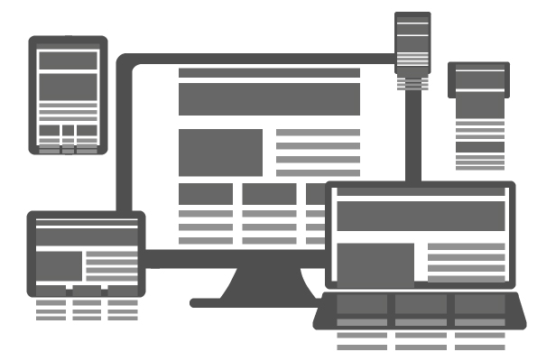
Responsive sites for an ever connected world
With a shift from desktop to mobile devices, HTML5 is proving the platform of choice for consistency in content delivery.
Since consumers are now browsing content, searching for information and making purchases on their mobile devices, it makes good financial sense for companies and brands to ensure that their online presence extends to this burgeoning medium. This means creating either specific mobile websites that users may be silently redirected to, or responsive site content that employs stylesheets in order to reorganise static layouts for either desktop or mobile platforms.
Over the past few years, the growth of mobile devices has offered a huge opportunity for companies to communicate their brand with audiences at any time or place. The sales of these devices sales have outnumbered those of personal computers, and tablet sales are increasing at an unprecedented rate.
Naked Penguin Boy operates a mobile first approach to development. This ensures that both information architecture throughout the development of a build as well as the user experience is designed for mobile hardware first, thereafter cascading through to other devices before reaching the desktop.
Our design process guides you through the many different stages of a build, starting with your business objectives and planning a user journey through to the generation of detailed wire frames and content that functions across mobile, tablets and the desktop.
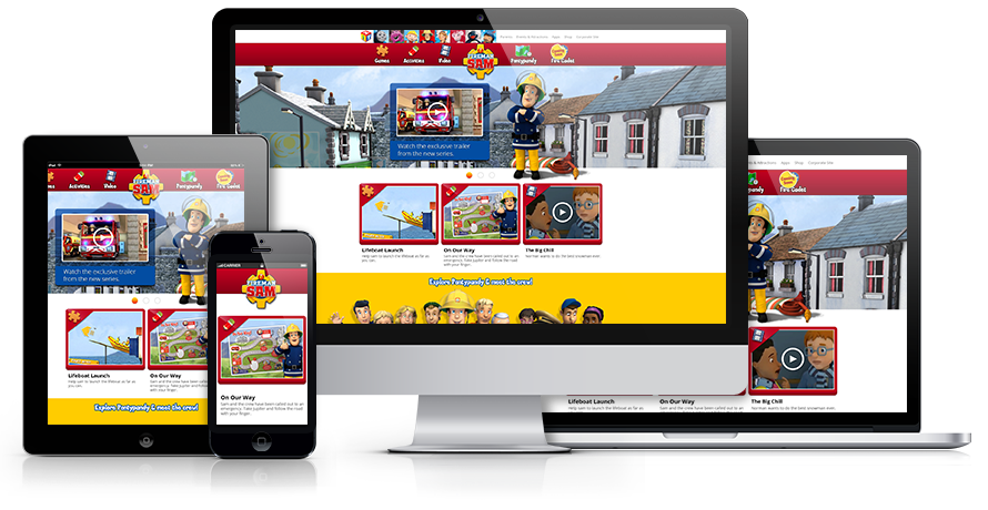
Fireman Sam
In 2008 we created the official Fireman Sam website in Flash, in 2014 we were tasked with updating this to HTML5 and to incorporate the new CGI elements into the website along with a string of games and downloads for fans of the brand.
View the Fireman Sam Case Study