The ever-changing world of digital marketing means marketers need to be constantly aware of changes on the playing field. With more and more users accessing the internet via their mobile or tablet devices, it is becoming necessary for brands to ensure that their websites are responsive and can accommodate a multitude of display sizes.
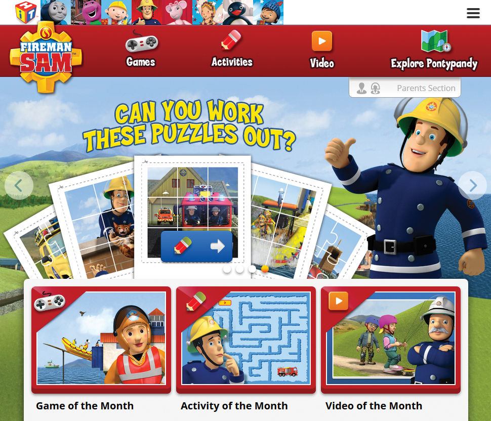
Mattel have just done that with the re-launch of their Fireman Sam website. The original build, created by Naked Penguin Boy in 2008, has now been reimagined with a responsive structure and launched in multiple languages.
Rowan Heasley, MD of My Turn Digital, says ‘It has been a pleasure working with Hit Entertainment and Mattel once again on Fireman Sam. The new website is a pleasure to interact with and will be more accessible to a far wider audience, on more devices than ever before.’
Rowan worked closely with Mattel New York, Hit Entertainment London and Cognizant Mumbai, in order to deliver the new Fireman Sam presence. The website can be viewed online at www.firemansam.com.
The build utilises a flexible grid-based structure, allowing content to adapt fluidly based on the screen size of the device in use.
In today’s world of multiple display dimensions, anything that utilises a fixed, unresponsive layout now risks alienating an audience that is moving slowly but surely to a variety of different devices and displays. In a relatively short space of time, fluid layout has become ubiquitous across the web, and will continue to gain a greater foothold as hardware manufacturers encourage the fragmentation of mobile and other devices used to access content online.
For more details on responsive design and development please visit https://myturndigital.com/


